CAse Study:
The ︎💚 of the PNW
The brief
THE CHALLENGE
Establish a design for Visit Seattle’s new campaign:
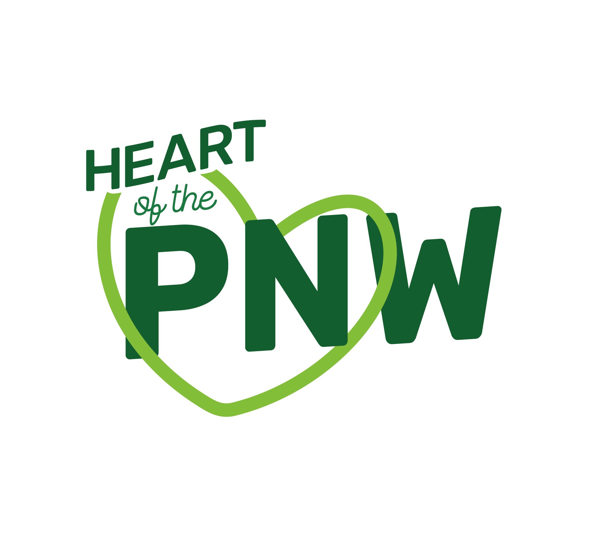
"The ︎💚 of the PNW"
Create print ads (8.5x11) and web ads (300x600px) bringing this new campaign to life.
TARGET AUDIENCE
20 to 30-somethings. Friend groups and young families who love to travel.
-
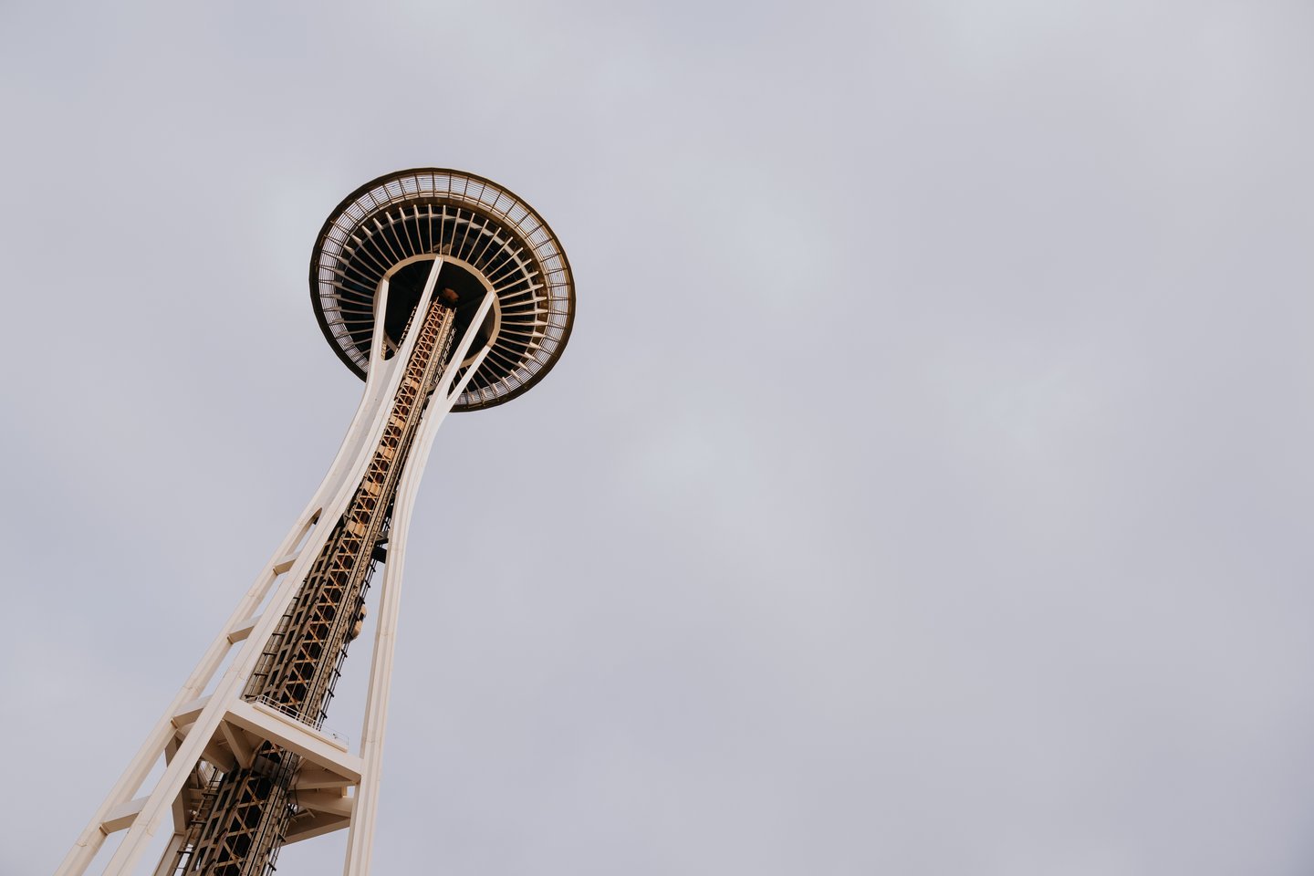
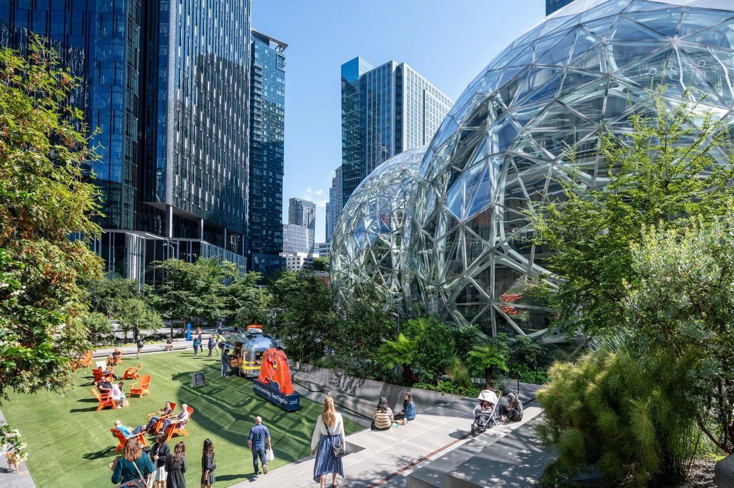
The first order of business was to understand how Seattle is the heart of the Pacific Northwest. Through a deep dive of the Visit Seattle website, partners, social media accounts related to the Pacific Northwest and Seattle, I was able to get a sense of how vibrant and diverse of destination it is.
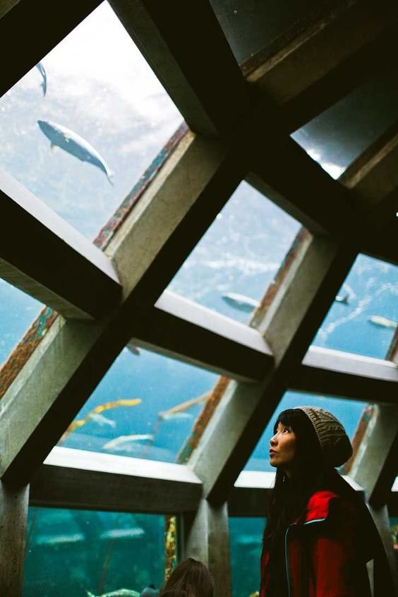
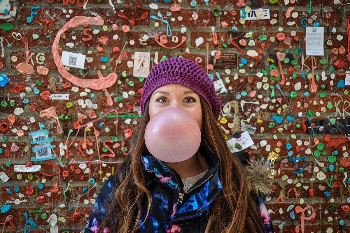
With the target audience in mind, I found imagery that aligned with Seattle being the place to visit on their trip to the PNW.


-
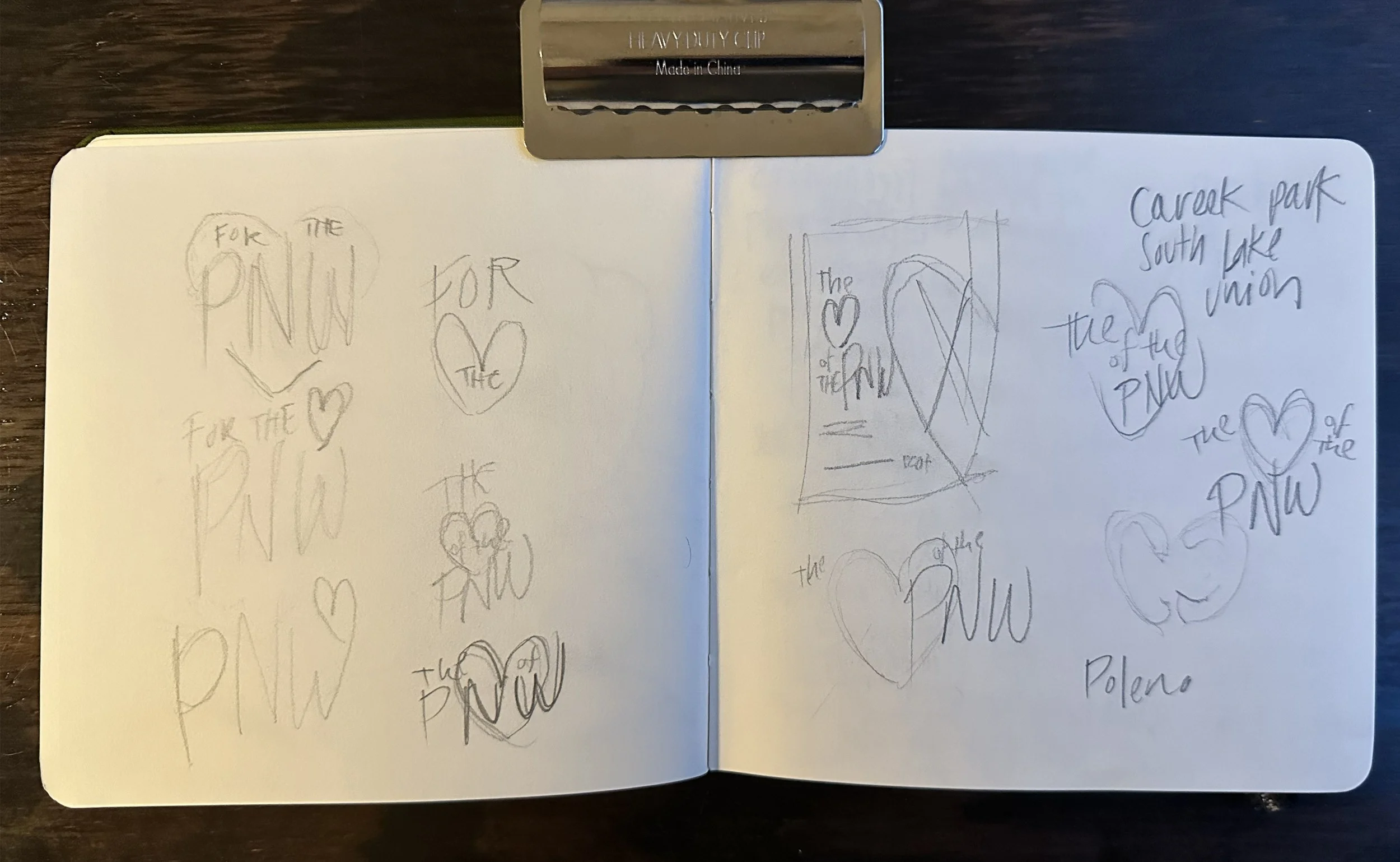
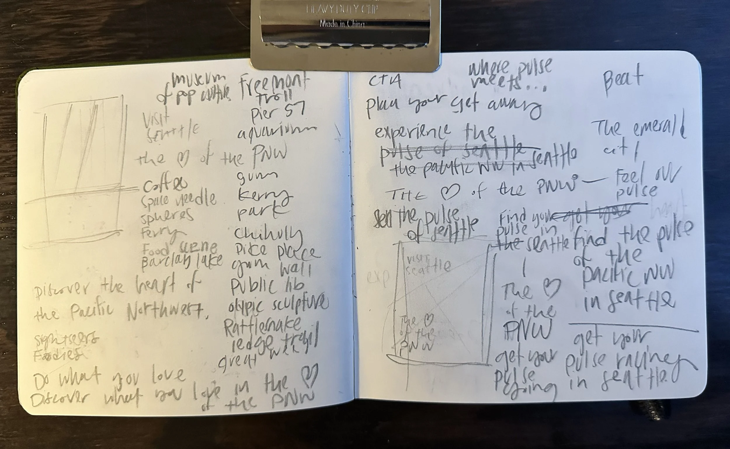
The campaign’s defining brand message is: “The 🖤 of the PNW”
However, the opportunity for a complementary call to action or sub-message seemed appropriate to help tie the campaign together. Thinking about the heart of the PNW, I wanted to find a tie-in that captured the energy of Seattle.
“The Pulse of Seattle” with complementary adjectives that aligned with the imagery works as great way to tie the main message to CTA that aligns with the target audience.
-
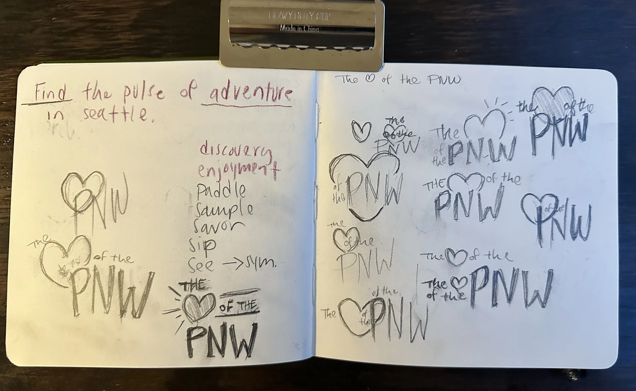
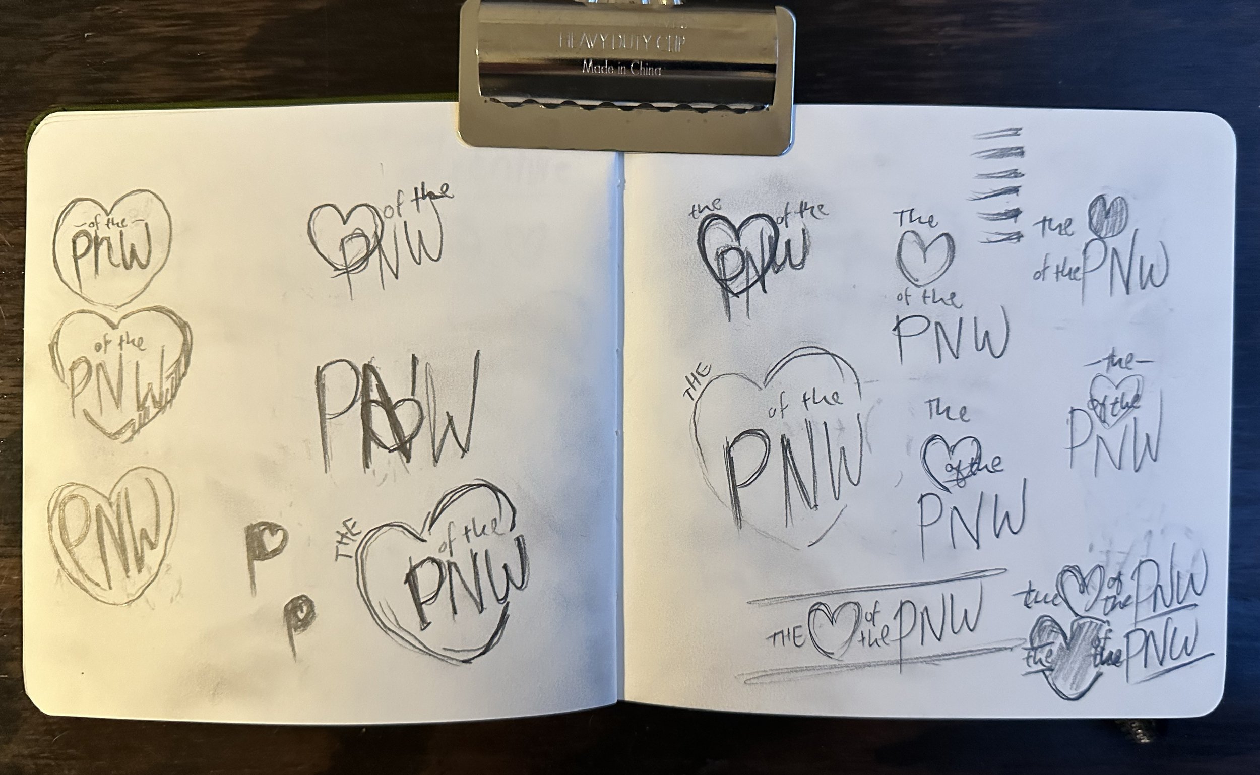
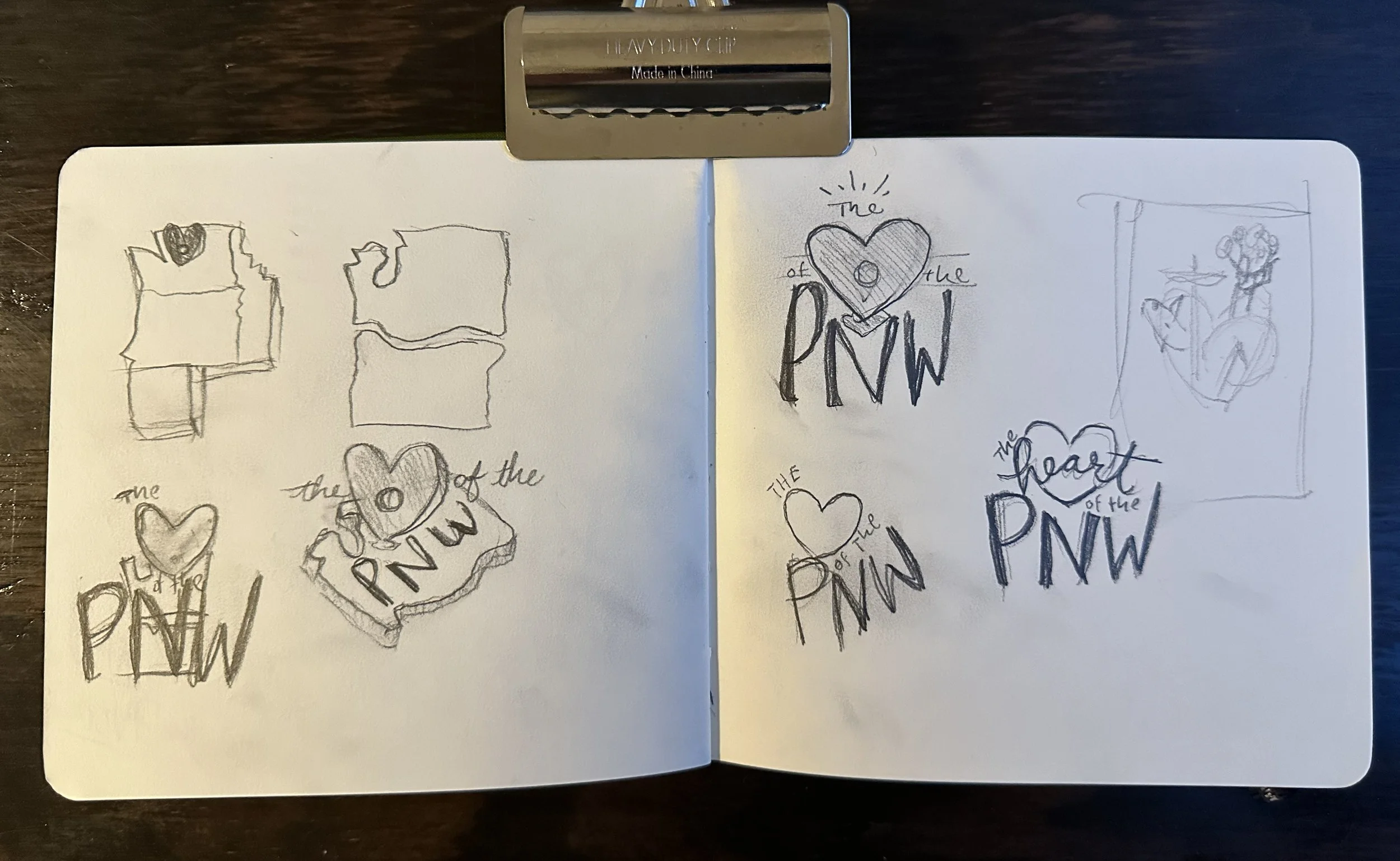
I wanted to find a way to create a brand graphic or lockup for the campaign that could be easily used across the multiple channels the campaign might be placed.
The lockup needed to be clean, clear to understand and versatile enough to work with a variety of images. It also needed to be fun and energetic without being too distracting from the other elements of the advertising.
Additionally, I felt it was important to subtly reference that Seattle is the “Emerald City”. Using a shade of emerald on the heart shape, helped accomplish this while also avoiding the usual cliche colors associated with hearts.
-
After research, sketching, thinking and tinkering, I created a campaign design that captured Seattle's wonder, excitement, and variety. The ads use overlapping elements, engaging photography and brand messaging to target the demographic of friend groups and families in their 20-30s.
Full-page print ads
-

Discover the Pulse of Excitement in Seattle
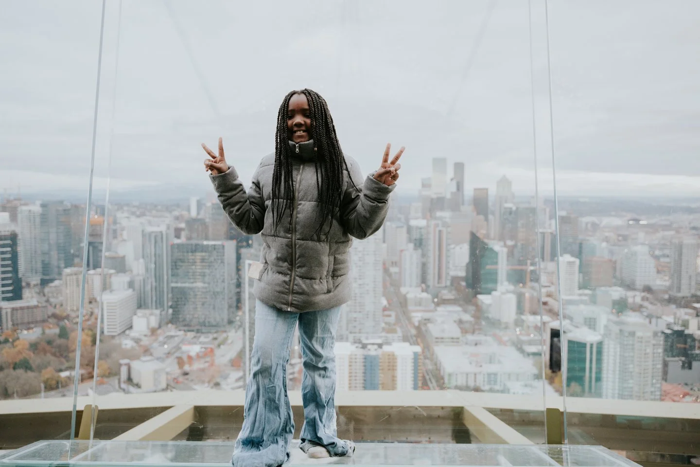
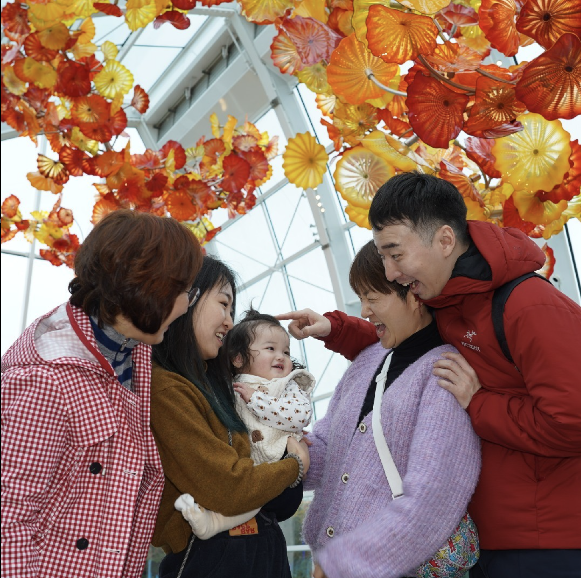
Full-page print ad targeting families with young children.
-

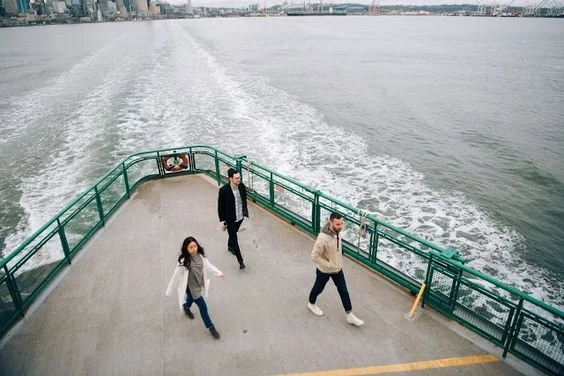
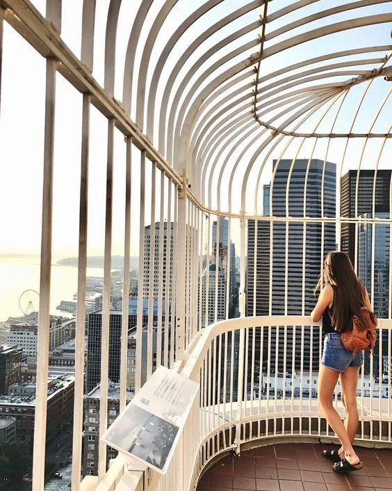
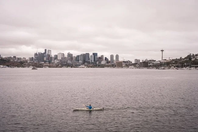
Find the Pulse of Adventure in Seattle
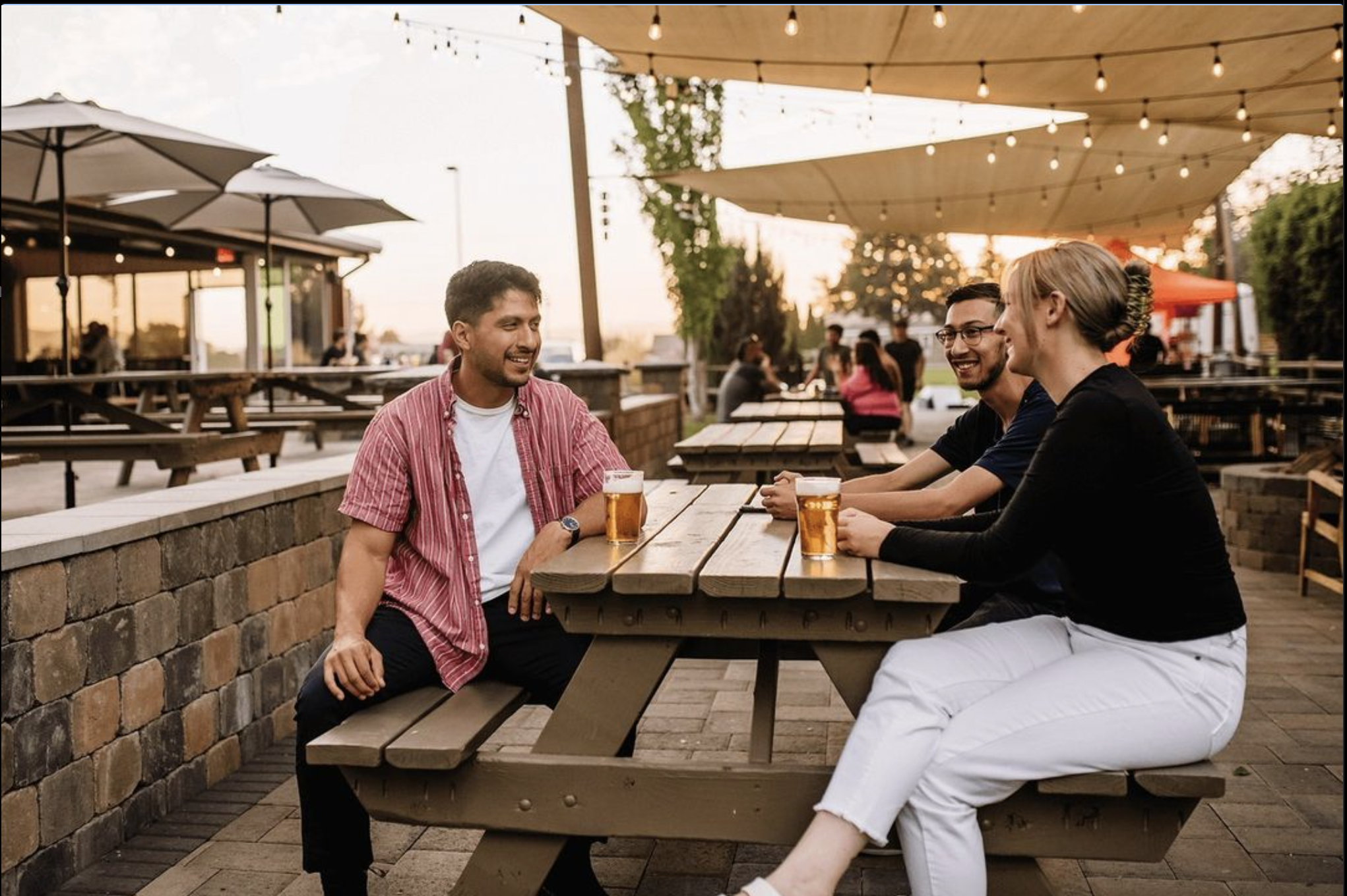
Full-page print ad targeting people in the 20s and 30s who love travel and adventure.
-

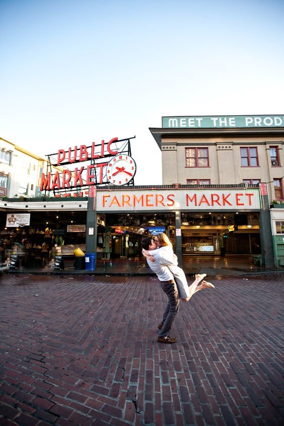
Celebrate the Pulse of Seattle
Full-page print ad targeting friends who enjoy travel and are in their 20s-30s.
-

Explore the Pulse of Nature in Seattle
Full-page print ad targeting families with young children that enjoy travel and having adventures.
Digital Ads


-
Through working on this campaign, a few concerns and ideas presented themselves:
Double The
The campaign messaging uses the word “The” twice. While not a huge issue, visually it seemed uncessarily repetitive.Also, the campaign could work by remove the first The, to become: 🖤 of the PNW. The brevity is refreshing and it removes an additional element to make the creative cleaner.
The Acronym
While PNW resonates with those that live in and around the Pacific Northwest, those that live in the Midwest, East Coast or South might not be familiar. Depending on the campaign placement this is either not a big deal or a huge deal.The message as it stands seems to be well suited to people that live outside of the PNW but within in driving distance, people within the PNW that are looking to explore more of it, or people outside of this that have a propensity to visit the Pacific Northwest.
Additionally, the digital display message would be work well for a retargeting effort for people that have recently interacted with content about the PNW or Seattle.
If this campaign is meant to be placed nationally where people not be as familiar, enhancing the copy or assets to connect the acronym of PNW with Pacific Northwest might be necessary to be effective.